Case study · AI benchmarking · 2025
Benchmarking: testing AI agents before they ship.
From a cluttered comparison grid to a structured evaluation system: compare models, test prompts, and see at a glance which one to ship.
01 · Problem
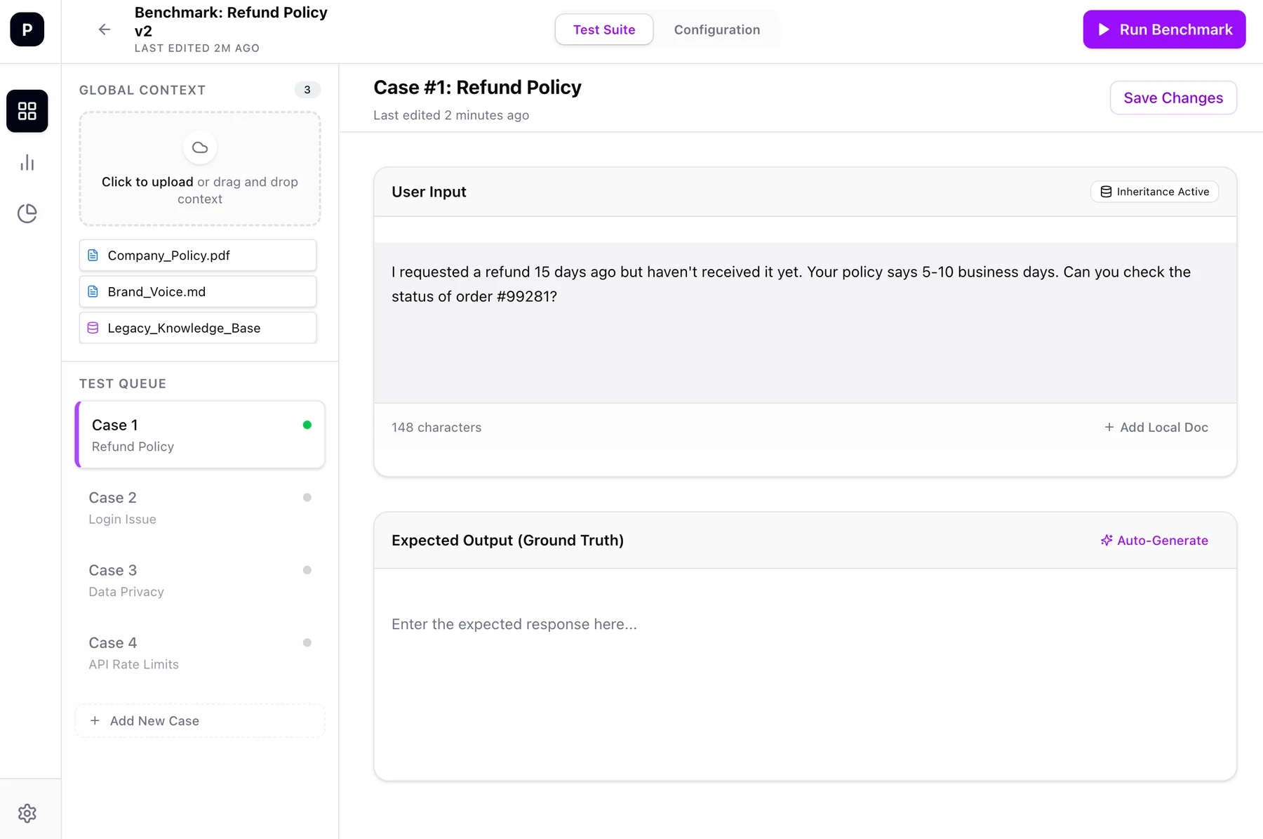
One screen did everything at once.
The old benchmarking interface showed everything in a single dense view with no clear hierarchy. Users couldn't configure evaluation criteria separately, compare model outputs in context, or get anything actionable from the results.
Benchmarking lets teams simulate, compare and validate AI agents across models, prompts and configurations before they reach production, with evaluative, operational and custom metrics in one controlled environment.
Design goals
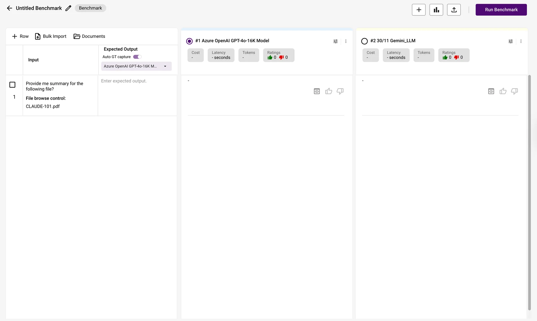
- Separate set-up from evaluationConfigure agents and metrics first, then look at results.
- Make comparison scannableRead which model won, row by row, at a glance.
- Surface why things failedFailure reasons and a recommendation, not just raw scores.
- Support multi-metric evaluationQuality metrics and responsible-AI metrics side by side.
02 · Solution
Set up, compare, analyse: one task per screen.
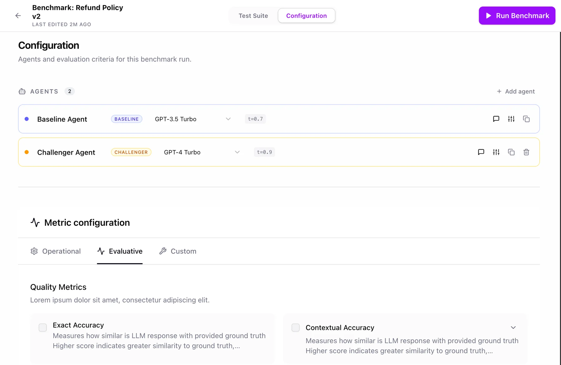
Configuration
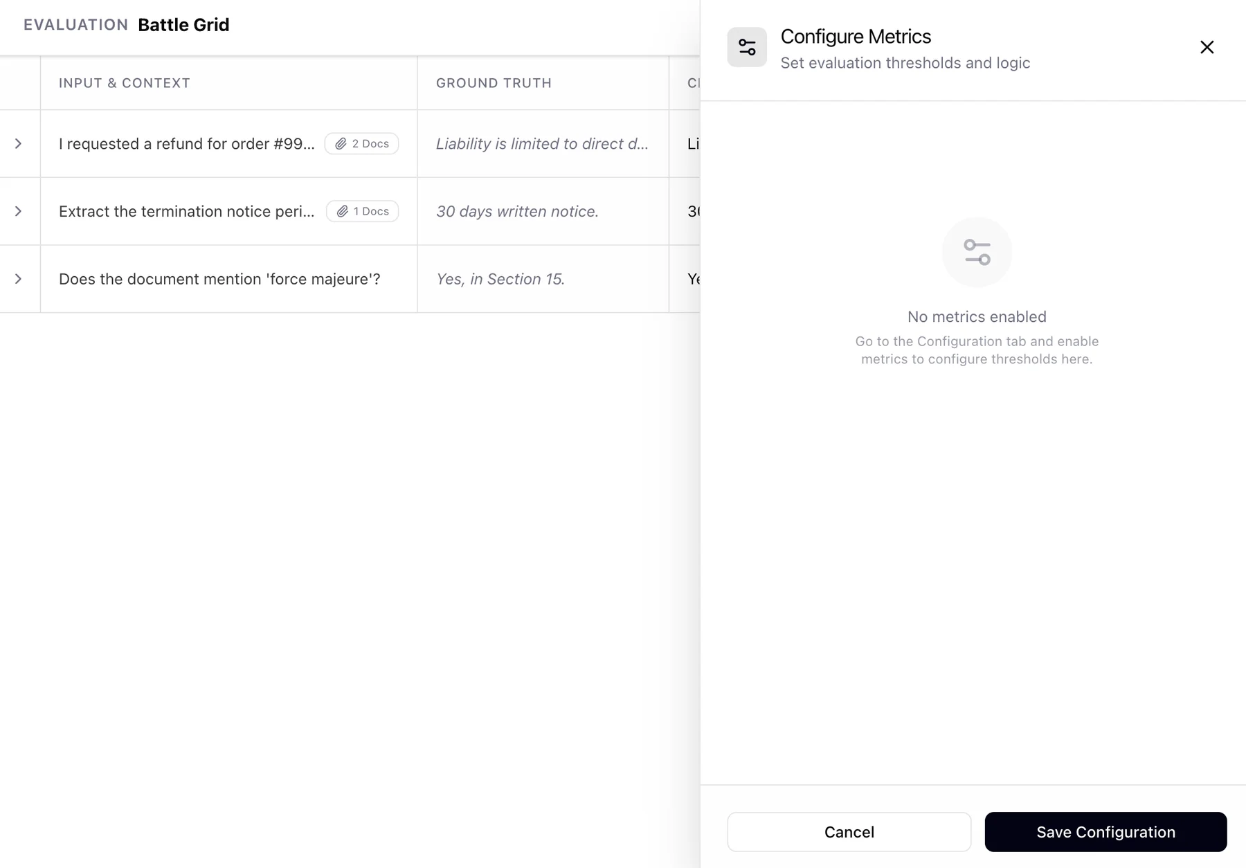
Define the Baseline and Challenger agents, pick models and temperature, and choose quality metrics (exact accuracy, contextual accuracy, groundedness) and responsible-AI metrics (bias, toxicity) before anything runs.
Battle Grid
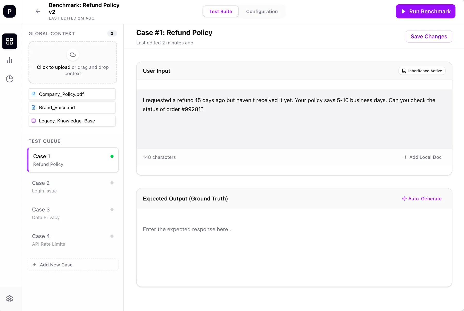
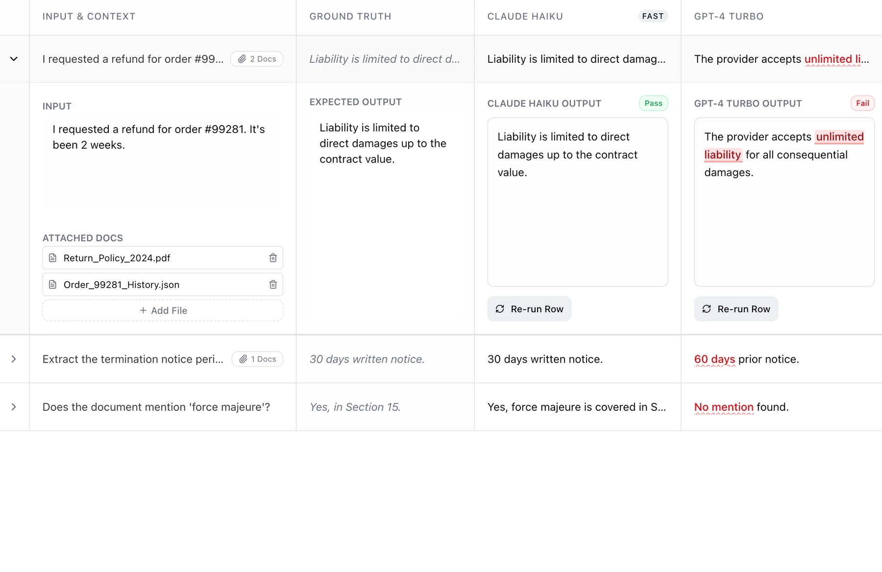
Each row shows the input, the expected answer (ground truth) and each model's response side by side. Failures are marked inline, so the diff is done for the reader.
Evaluator Dashboard
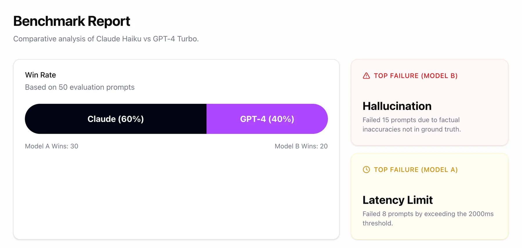
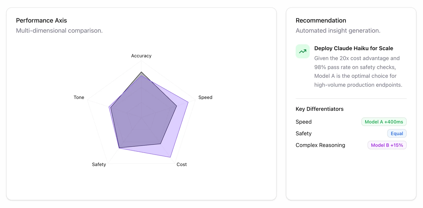
A win-rate bar, a radar across accuracy, speed, tone, safety and cost, the top failure reasons per model, and an automated recommendation on what to deploy.
03 · Decisions
Four calls that shaped the flow.
Tap a card to see the decision.
04 · Who it's for
Four groups, eight jobs.
Performance trends and explainability reports.
Audit logs, usage history, policy adherence.
Model drift, token spikes, latency.
A high-level view of what is ready to ship.
- Evaluate agent performanceAccuracy, groundedness, faithfulness, relevance, contextual accuracy.
- Regression testingCatch quality drops after a prompt or configuration change.
- Compare LLMs and configurationsGPT-4, Claude, Gemini at different temperature and top-p, on one grid.
- A/B test prompt variantsBaseline against challenger, row by row.
- Surface weak spotsRow-level inspection of where an agent fails.
- Optimise operational metricsToken usage, latency and cost.
- Apply custom metricsLLM-as-a-judge for tone, compliance and brand style.
- Audit and track over timeRepeatable runs and historical summaries.
05 · Results
What the redesign changed.
| Area | Before | After |
|---|---|---|
| Clarity | One cluttered view | A three-step structured flow |
| Diagnostics | No failure context | Inline pass/fail and top failure reasons |
| Actionability | Raw data only | Recommendations and key differentiators |
In development. This version already includes the changes that came out of a round of usability testing, and stakeholder feedback on it has been encouraging. Outcomes will be measured once it ships; the table describes the design change, not a measured result.
Even highly technical tools benefit from structured information architecture. Splitting one dense interface into three views, each matched to a distinct task, reduced the cognitive load and made evaluation results something a team can act on.
06 · Prototype